Translating personality into design

McGoa Holidays

Being one of thousands of Airbnb’s in Goa, having a logo and a brand identity is the first step towards bringing legitimacy to the business. Something as simple as a logo for McGoa Holidays goes a long way in helping bring in desired business and enhance the hosts’ reputation in the long haul. We helped McGoa Holidays with a logo that makes them instantly recognizable, conveying stability, care, and relaxation.

The Challenge

Branding a small business is unquestionably one of the biggest steps an entrepreneur/small business can make – rife with uncertainty, questions, and confusion, which, being a small business ourselves, we understand fully. McGoa Holidays was quite unclear about what they wanted the logo to look like or represent.

Secondly, every room at every McGoa Holiday property is designed to look different from the next – so designing a logo that represents each one harmoniously was a challenge.

What We Did

We began by asking dozens (was it hundreds?) of questions to begin to define what the client likes, doesn’t like, what their expectations are, and more. We then created a list of words that best describes the property, the kind of guests the brand wishes to attract, the USPs and the experience the brand wishes guests to have, among other things. Our designers then began working on the typeface, colors, and iconography. After a couple of iterations, we had a winner.

The Result

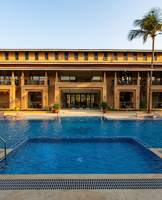
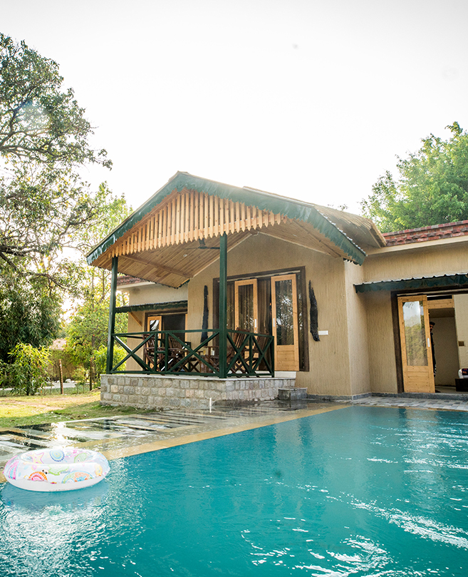
Every room offered guests a different experience and vibe, hence finding an iconic commonality among dozens of rooms was out of the question. But since walking to their rooms and swimming in the pool at McGoa Holidays would be a common experience every guest would have, we decided to use their archetypal floor tiles as inspiration. The tiles, like the large, rounded cobblestones in Mykonos alleyways are prominent from wherever in the property one is.

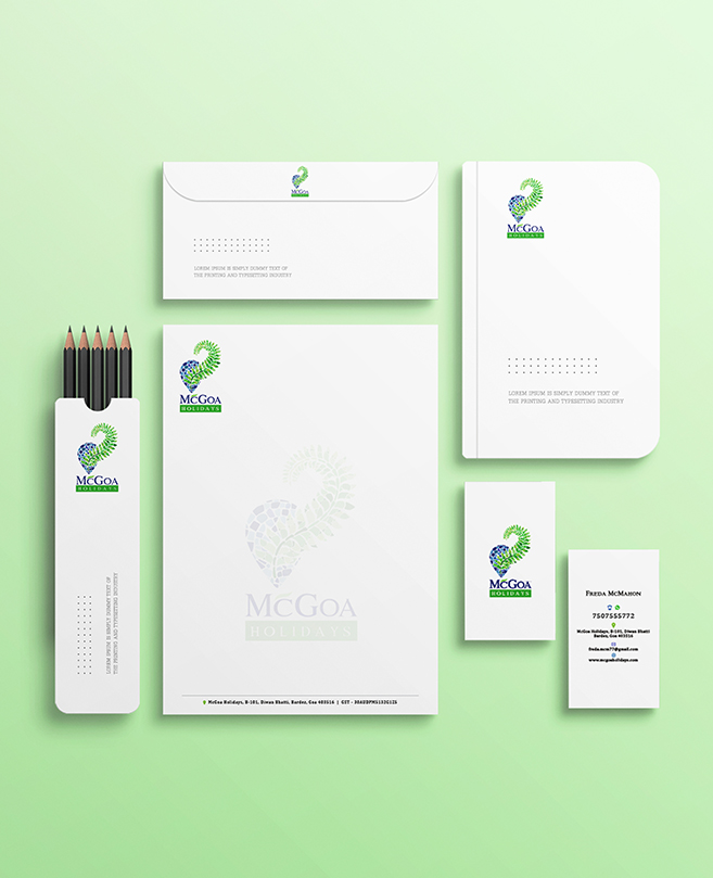
The vibrant hues of blue and green in the pool coupled with the soothing shades of blue and green – or the sky and foliage – that surround the property – gave us our colour scheme. Rather than opting for the usual coconut palms, sun and sea that are done to death in Goa, we made use of a modern GPS location pin as the icon – since each room at McGoa Holidays is a destination in itself. The logo crosswalks luxury and affordability – mirroring the message that the brand isn’t a budget backpacker destination, nor is it high-end in terms of luxury. It’s homely, comfortable, clean, spacious, breezy, and elegant – on a budget.

Chat with Us
Contact Us